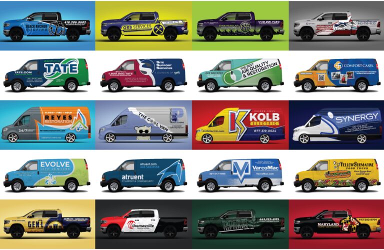
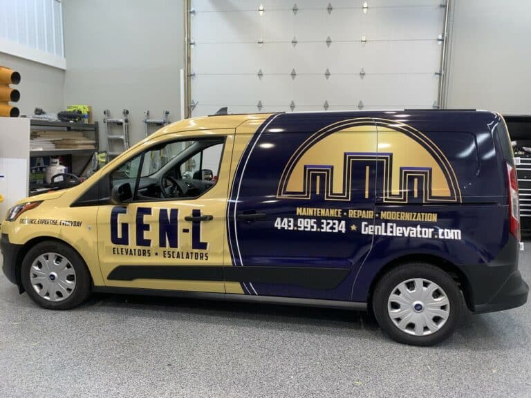
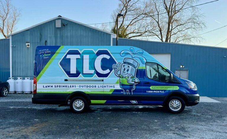
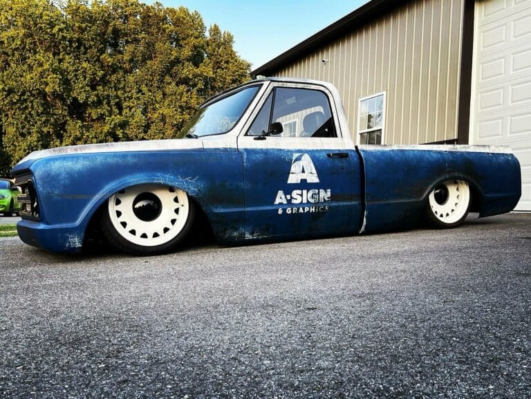
Designing a vehicle wrap is an exciting opportunity to showcase your brand and attract attention on the road. However, certain mistakes can detract from the effectiveness of your wrap and diminish its impact. Let’s explore some common pitfalls to avoid when creating your wrap design:
- Cluttered Design: A cluttered design can overwhelm viewers and make it difficult for them to understand your message. Keep your design clean, simple, and easy to read. Focus on highlighting key elements such as your logo, brand name, and contact information.
- Too Wordy: Using too much text on your wrap can be overwhelming and distracting. Stick to concise and impactful messaging that quickly communicates your brand’s identity and value proposition. Remember, less is often more when it comes to wrap design.
- Color Clashes: Choosing colors that clash or overpower each other can create visual discordance and make your wrap design appear unprofessional. Opt for a color scheme that complements your brand’s aesthetic and enhances readability. Bright, catchy colors can attract attention without overwhelming the viewer.
- Ignoring Vehicle Shape: Failing to consider the contours and features of your vehicle can result in a wrap design that looks distorted or awkward when applied. Take into account the vehicle’s shape and design your wrap to flow seamlessly with its curves and lines. This will ensure a cohesive and professional appearance.
- Forgetting Brand Consistency: Your vehicle wrap should align with your brand’s overall visual identity and messaging. Maintain consistency in design elements such as colors, fonts, and imagery to reinforce brand recognition and credibility.
- Avoid Enlarging Low-Resolution Images: Resist the temptation to enlarge low-resolution images to fit your design. Enlarging images beyond their original size can result in pixelation and loss of detail, making them appear blurry or distorted when printed. Instead, opt for images that are appropriately sized for your design layout.
Creating an effective vehicle wrap design requires careful attention to detail and thoughtful consideration of your brand’s messaging and aesthetic. By avoiding common mistakes such as cluttered design, excessive text, and color clashes, you can create a wrap that captivates attention, communicates your message clearly, and leaves a lasting impression on viewers. Keep it clean, keep it catchy, and watch your wrap turn heads wherever you go.
Need some help designing your vehicle wrap? Request a free estimate.


